The most innovative aspect of the LMU identity system, the spirit mark, was inspired by the 500-year-old Jesuit seal. The art deco sunburst arrayed around the perimeter of the Jesuit seal was painted as a fresco in St. Ignatius’ rooms in Rome. In the LMU spirit mark, it is simplified and fashioned into the lion’s mane to infuse the Ignatian tradition into the university mascot.

Spirit marks are often adopted by sports fans, students, and alumni/student organizations to inspire pride and loyalty in non-academic contexts. The LMU spirit mark is designed as a fully integrated visual element in the identity system. It is an ownable and differentiating icon that is totally unique to LMU.
The spirit mark is used in less-formal applications with the goal of building and encouraging school spirit. It is used by student organizations and to promote LMU student programs. The spirit mark is also a secondary logo for LMU Athletics programs.
Clear Space
Adequate clear space for the spirit mark is defined at 1/4 of its height extended around its perimeter. No other graphics or text should interfere with this area.

Minimum Size
The minimum size of the spirit mark is 0.5 inches. There is no maximum size use.

Incorrect Use
Incorrect uses of the spirit mark are shown below. Incorrect usage rules apply to all marks in the LMU identity toolkit.

Don't disproportionately scale vertically or horizontally.

Don't alter the size relationship between any elements.

Don't crop any parts of the mark.

Don't rotate the mark.

Don't alter the shape or positioning of any elements.

Don't rearrange components within the mark.

Don't add a drop shadow.

Don't add additional artwork or outlines around the mark.

Don't use unapproved colors.

Don't interchange any of the colors.

Don't display at less than 100% opacity.
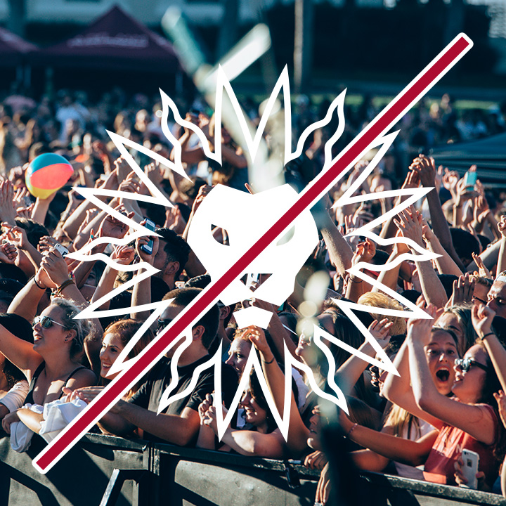
Don't place the logotype over a busy or complex photograph.

Don't change or omit the white areas between colored elements.
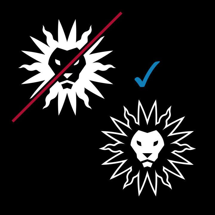
Don't make the colored elements white. The white "Sticker" version of the mark is different.