LMU’s visual identity is a comprehensive, integrated system of colors, typography, and marks that work together to present a unified and impactful image of the university. This system brings consistency across all programs and communications, helping to strengthen and elevate LMU’s reputation.
Compelling visual identities require discipline, consistency, and thoughtful use. The elements outlined here are key tools that express a cohesive brand system, ensuring LMU’s image remains strong, recognizable, and respected. For more information, download the visual identity guide.
Signage
Daily Communications
Stationery
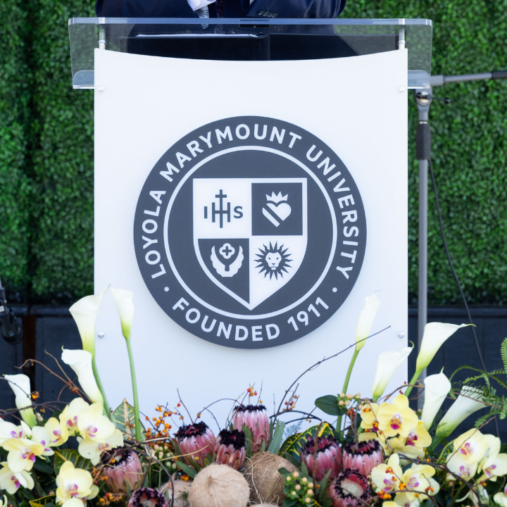
Signage
Unit-Level Signage
Unit-Level Daily Communications
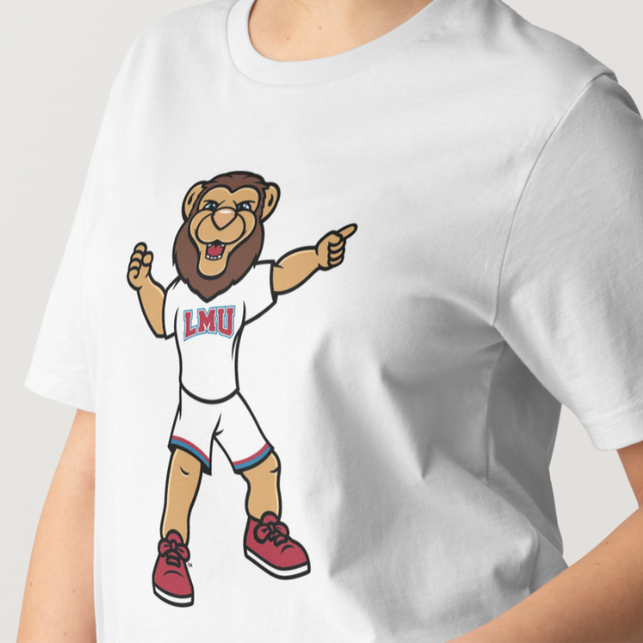
Official Team Gear & Apparel
Bookstore Merchandise
Marks
LMU’s brand includes distinct but complementary marks. Each serves a unique purpose and must be used appropriately. These marks are aligned in style and intent, but are not interchangeable. All are protected and trademarked by the U.S. Patent and Trademark Office and require prior approval for use.

Stationery
Signage
Daily Communications

Spirit Wear
Secondary Athletics Mark
Team Uniforms
Official Gear & Apparel
Bookstore Merchandise
Diplomas
Academic Regalia
Honorary Degrees
Informal Applications