
The primary mark is the most widely recognized and frequently used in LMU’s visual identity system. It symbolizes LMU’s academic excellence and mission, drawing from the traditions of our Jesuit and Marymount founding orders and expressing them in a modern, digital-forward form.
Use of the primary mark is reserved for official university communications and must follow LMU’s identity guidelines. It may not be downloaded or recreated without prior approval.
Clear Space
Adequate clear space for the primary mark is defined as the cap height of the M extended around its perimeter. No other graphics or text should interfere with this area.

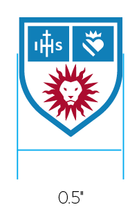
Minimum Size
The minimum size of the primary mark is 0.5 inches. There is no maximum size use.
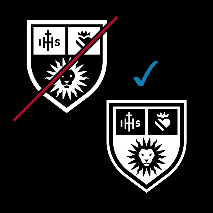
Incorrect Use
Incorrect uses of the primary mark are shown below. Incorrect usage rules apply to all marks in the LMU identity toolkit.

Don't disproportionately scale vertically or horizontally.

Don't alter the size relationship between any elements.

Don't crop any parts of the mark.

Don't rotate the mark.

Don't alter the shape or positioning of any elements.

Don't rearrange components within the mark.

Don't add a drop shadow.

Don't add additional artwork or outlines around the mark.

Don't use unapproved colors.

Don't interchange any of the colors.

Don't display at less than 100% opacity.

Don't place the logotype over a busy or complex photograph.

Don't change or omit the white areas between colored elements.
Don't make the colored elements white. The white "Sticker" version of the mark is different.