The secondary logos remain important tools for specific audiences and contexts. These logos include the university's full name and are most often used in external communications where geographic clarity or institutional formality is beneficial.
Secondary University Logo Full Name
This version spells out the full university name and is typically reserved for formal, external communications or when clarity is needed with unfamiliar audiences.


Secondary University Logo Type Above
This version is an alternative to the LMU logo for condensed spaces and swag.

Clear Space
Adequate clear space for the primary logo lock-ups is defined as the cap height of M extended around the lock-up's perimeter. No other graphics or text should interfere with this area.

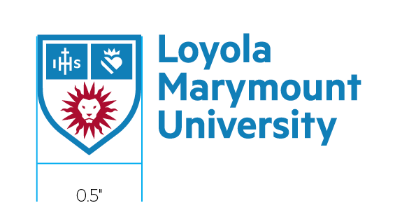
Minimum Size
The minimum size of primary logo lock-ups contains a shield mark at 0.5-inches-wide with the wordmark at the same scale. There is no maximum size use.
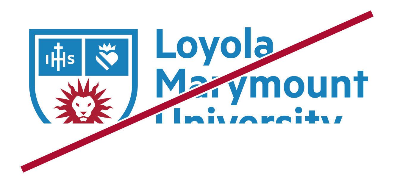
Incorrect Use
Incorrect uses of the primary logo lock-ups are shown below. Incorrect usage rules apply to all marks in the LMU identity toolkit.

Don't disproportionately scale vertically or horizontally.

Don't alter the size relationship between any elements.

Don't change the fonts or typography.

Don't alter the provided text.
Don't crop any parts of a lock-up.

Don't rotate a lock-up.

Don't alter the shape or positioning of any elements.
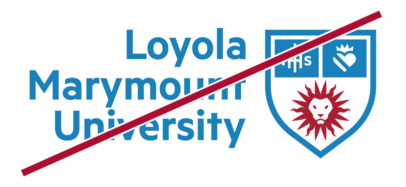
Don't rearrange components within a lock-up.

Don't add a drop shadow.

Don't add additional artwork or outlines around a lock-up.
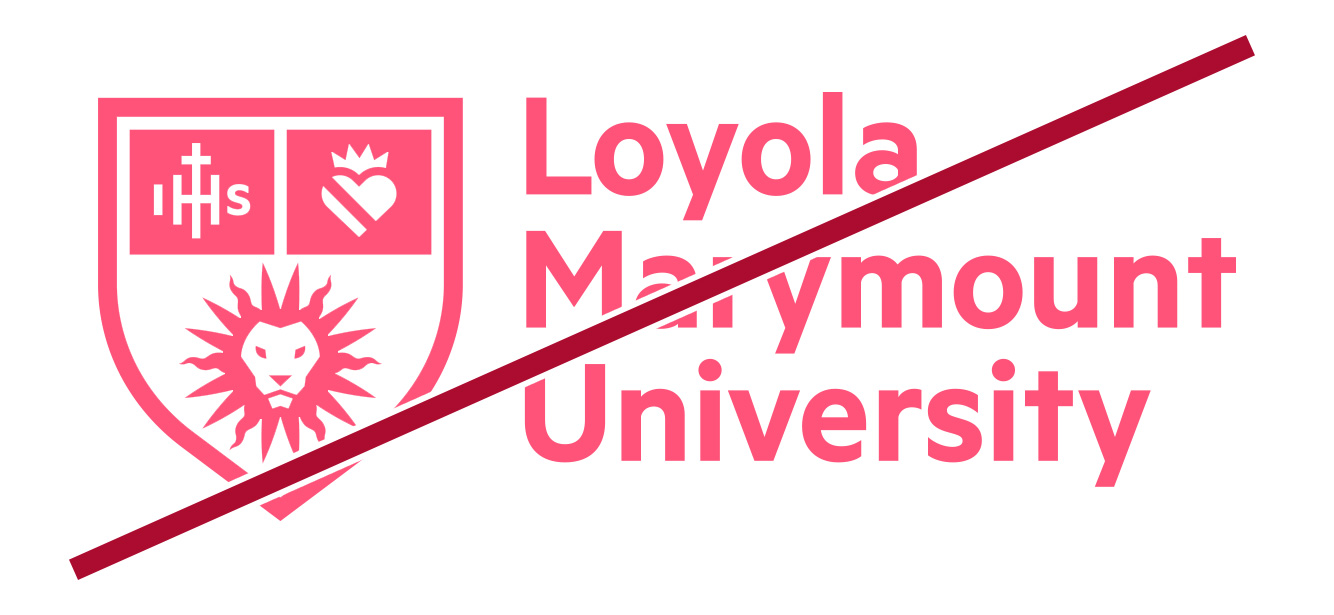
Don't use unapproved colors.

Don't interchange any of the colors.

Don't display at less than 100% opacity.

Don't place the lock-up over a busy or complex photograph.

Don't change or omit the white areas between colored elements.

Don't make the colored elements white. The white "Sticker" version of the mark is different.